
Entertainment websites are some of the most demanding projects in web design. They serve huge catalogs, attract visitors from many countries, run on every kind of device and compete with dozens of alternatives that are only one tap away. Streaming services, ticketing platforms, gaming portals and online casinos such as Aerobet have to solve the same problems that every growing website eventually faces, only at a larger scale and with less patience from users. Looking at how these platforms approach mobile design offers practical lessons for anyone building a theme, a store or a content site, whether the audience is in Toronto, Montréal or anywhere else.
Design for the Thumb, Not the Mouse
Most entertainment traffic now arrives on phones, and phones are used with one hand while people are on the couch, on a bus or in a queue. Navigation that works with a mouse often fails with a thumb. Entertainment platforms tend to place key actions within easy reach: a bottom navigation bar, a prominent search icon and large, clearly separated buttons.
Tap targets deserve real attention. Apple’s guidelines recommend a minimum of about 44 by 44 points for touch controls, Google’s Material Design suggests 48 by 48 density-independent pixels, and WCAG 2.2 sets a minimum target size of 24 by 24 CSS pixels for accessibility. Small icons placed close together cause mistaps, frustration and abandoned sessions. A good test is to use your own design with one thumb while walking. If you hesitate, your users will too.
Forms are where many mobile journeys end early. Registration and checkout screens on entertainment platforms are usually short and split into clear steps, because every extra field costs sign-ups. Use the correct input types so phones show the right keyboard, such as a numeric pad for phone numbers or an email keyboard for addresses. Add autocomplete attributes so browsers and password managers can fill details automatically. Show validation messages next to the field as the user types, not in a red block at the top after they press submit.
Make Large Catalogs Easy to Explore
A streaming service may hold thousands of titles, and a gaming platform can offer thousands of games from dozens of studios. Nobody browses that much content by scrolling. Successful platforms combine several ways to find things: curated rows such as “new” or “popular”, filters by category and provider, and a fast search that starts suggesting results after a few letters.
The same principles apply to any site with more than a few dozen items:
- Offer at least two paths to every item, for example a category and a search result.
- Keep filters visible and reversible, so users can see what is applied and remove it with one tap.
- Show useful information on each card, such as a clear title, an image and one or two key attributes.
- Remember recent activity, so returning visitors can pick up where they left off.
Category pages also benefit from short descriptive text and real links to each item. Search engines need crawlable links and readable content to understand large catalogs, so infinite scroll should always be backed by paginated, linkable pages.
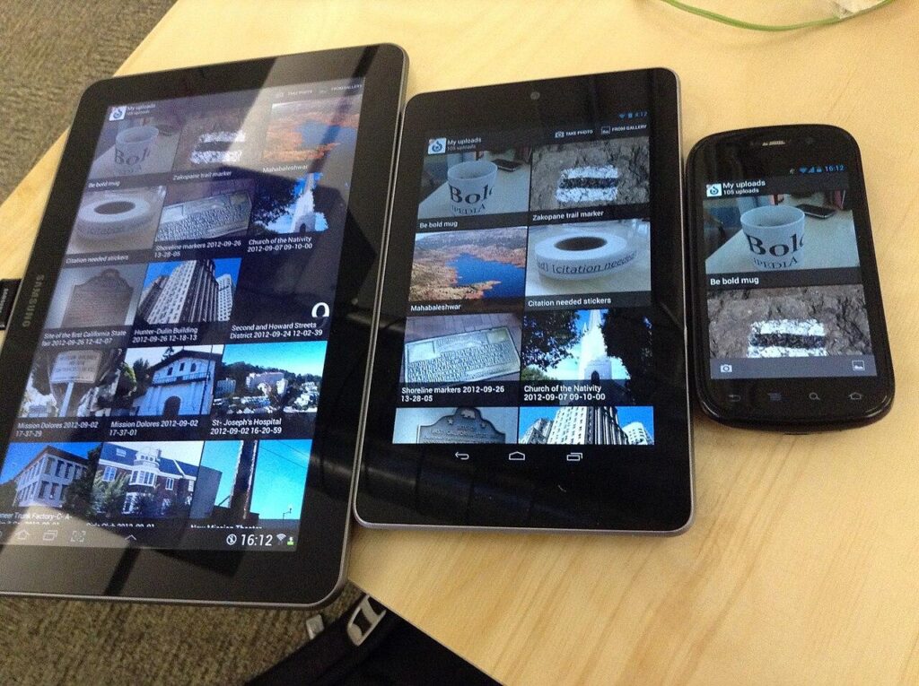
The same app on tablets and a phone. Layouts must adapt without hiding key actions. Image: User:tfinc, CC BY-SA 3.0, source: Wikimedia Commons.
Speed Is a Feature
Entertainment users are impatient by nature. They came for something fun, and a slow page feels like a barrier. Google’s Core Web Vitals give designers a clear set of targets. Largest Contentful Paint, which measures how quickly the main content appears, should happen within 2.5 seconds. Interaction to Next Paint, which replaced First Input Delay in March 2024, should stay under 200 milliseconds. Cumulative Layout Shift, which measures unexpected movement of content, should stay below 0.1.
|
Metric |
What it measures |
Good threshold |
|
Largest Contentful Paint (LCP) |
How fast the main content loads |
2.5 seconds or less |
|
Interaction to Next Paint (INP) |
How quickly the page reacts to input |
200 milliseconds or less |
|
Cumulative Layout Shift (CLS) |
How much content jumps while loading |
0.1 or less |
Image-heavy catalogs make these targets challenging. Practical fixes include serving modern image formats such as WebP or AVIF, setting explicit width and height for thumbnails so the layout does not jump, lazy-loading images below the fold and keeping third-party scripts to a minimum. Every tracking pixel and widget adds weight, so audit them regularly.
Localization Is More Than Translation
Large entertainment platforms often run in many languages at once. Aerobet, for instance, is an online casino and sportsbook offering slots, live dealer games, crash games and sports betting, with a dedicated English version for Canada alongside French and many other language versions. Running a site like this well involves much more than translating menu labels. Content, formats and even layouts must adapt to each audience.
In Canada, bilingual design is a practical reality. Businesses that serve customers in Quebec are generally expected to provide French content under the province’s language law, and many national brands offer full English and French experiences everywhere. French text often runs longer than English, so buttons and navigation must have room to grow. Dates, times, currencies and number formats differ too: in French, the decimal separator is a comma and the currency symbol usually follows the amount.
Technical Basics of Multilingual Sites
Behind the scenes, multilingual sites need a solid structure:
Build Accessibility Into the Foundation
Accessibility improves the experience for everyone, from people with visual impairments to users in bright sunlight or with one hand busy. In Ontario, the Accessibility for Ontarians with Disabilities Act requires many organizations to meet WCAG 2.0 Level AA for their websites, and WCAG 2.2 is now the current version of the guidelines.
Key practices include sufficient color contrast, which is especially important for the dark themes popular with entertainment platforms, visible focus states for keyboard users, meaningful labels for icons and buttons, and captions for video content. Animations should respect the user’s reduced motion setting. None of these features gets in the way of an attractive design, and many of them make interfaces clearer for all users.
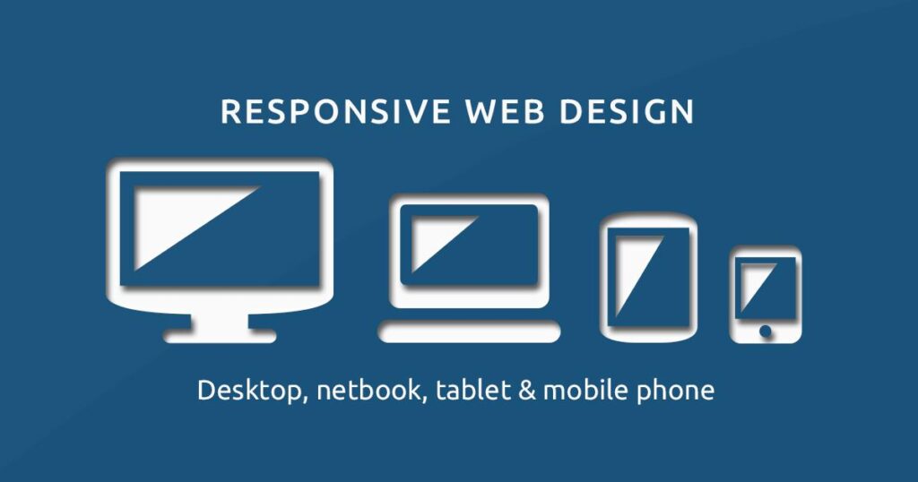
Responsive design covers desktops, laptops, tablets and phones with one flexible layout. Image: Muhammad Rafizeldi (MRafizeldi), CC BY-SA 3.0, source: Wikimedia Commons.
Respect the User’s Attention
Entertainment platforms that keep loyal audiences tend to avoid manipulative patterns. Constant pop-ups, hidden cancellation steps and confusing consent banners might lift short-term numbers, but they damage trust. Clear account settings, transparent terms and easy access to tools such as notification preferences, spending limits and account deletion show users that the platform respects them. For sites that deal with money or age-restricted content, visible age requirements and responsible-use information are part of good design, not an afterthought.
The best mobile-first interfaces feel effortless because every detail has been considered: the position of a button, the speed of a thumbnail, the length of a French label, the contrast of a dark theme. Entertainment platforms show what happens when those details are handled at scale. Applying the same discipline to a small business site or a new WordPress theme leads to the same result: users who find what they want quickly and come back because the experience simply works.